Usability Study: Radio Buttons and Checkboxes
" I wanted to know how checkboxes can be used. "
PREFACE
I started this study with a predisposition that, in general, how checkboxes and radio buttons get implemented in surveys and forms by several websites lack affordance, making it more difficult than it has to be for users. Those inconsistencies can significantly impact overall experience of filling forms and surveys.
USABILITY STUDY
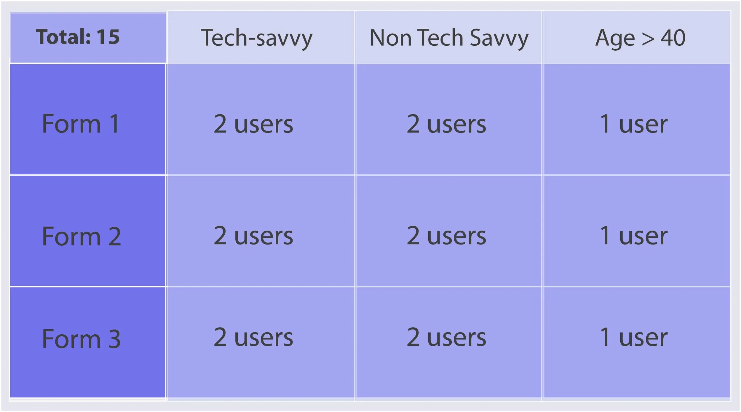
To test my hypothesis, I ran an online usability evaluation on 15 people of varying age and technical background using three different forms. Each person evaluated only one form, while the population was distributed equally across age and computer literacy so that each form had equally diverse participants.
In order to keep the difficulty level similar to all the participants, I kept the questions in the form easy to answer and least intrusive to their privacy. After filling the form, they were prompted to fill in a short survey to rate the overall experience of filling the form.
Distribution of the participants.
The three forms I used:
1. A basic HTML form with no CSS or Library support.
**Notice zero affordance to tell that the text and the buttons are clickable
2. A form using Bootstrap default classes : radio and checkbox.
3. A form with enhanced Bootstrap class and higher affordance. Try it yourself!
FINDINGS
From implementing the forms
The basic HTML Checkbox and Radio buttons has zero affordance (tag: <input>). With such implementation, neither the text or the buttons show that they are clickable. The cursor remains the same as a arrow pointer when hovered on the text.
Bootstrap does a better job. Bootstrap's is one of the most commonly used open source CSS library. Its Classes "checkbox" and "radio" do a better job by changing the cursor to a pointer when hovered on the text (but not on the button icons).
This implementation is perhaps the most efficient and widely applicable. But, can we not provide higher affordance to radio buttons? "Not every user is aware of how the radio buttons work." Although they are commonplace, they still demand a small amount of learning curve for a novice user.
Insight: Designers and developers alike must be be aware of such implications and must make sure to implement the right kind of checkboxes and radio buttons catered for their user population.
From Usability study
An interesting finding was that users rated the 'enhanced bootstrap form' (form 3) slightly higher than 'Default Bootstrap form' (form 2) for overall satisfaction while the 'Basic HTML form' (form 1) was rated the least; While the time taken to fill the forms were not significantly different.
FOR BETTER RESULTS
The quality of study I conducted does not allow me to make a profound claim. Along with the limited sample size of users, I did not consider several factors like content of the form, context of use, Mobile v/s Desktop, etc.
More rigorous methods like Heat maps or Lab studies would have helped validate recording times and ease of using the forms. Since the survey was conducted online, external factors like other distractions, internet disconnections were not tracked as well.
CONCLUSION
- Several such micro-interactions, and adding such affordances can significantly improve usability and overall user experience.
- Something as simple as Checkboxes and Radio buttons need equal and undivided attention from both designers and developers if we are seeking to provide a seamless user experience.


