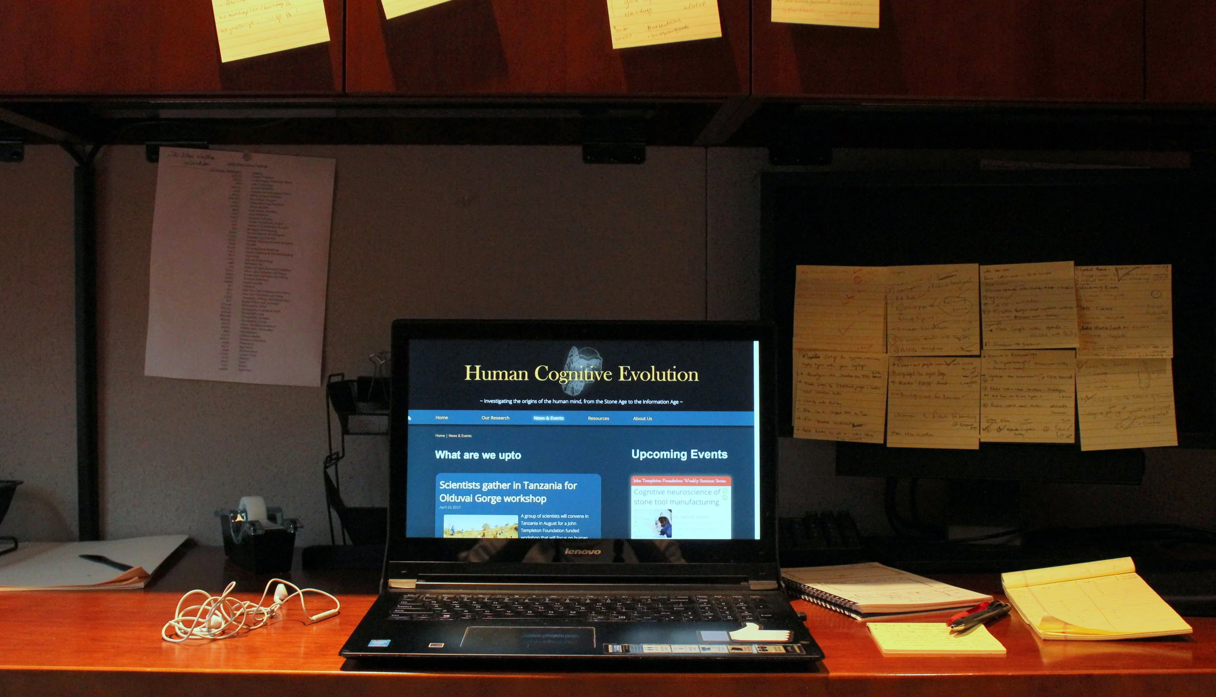
" The fun I had designing and coding this summer "
This summer I got a chance to work at the Stone Age Institute.
My Title: UI Designer and developer. | My job: Refine, Redesign, develop and launch their website.
CHALLENGE
Stone Age Institute (STI) is an anthropological research institute. They received a 3.2 million dollar grant to research on 'Human Cognition Evolution', dedicated to understand how the humans developed their cognitive abilities over the past million years.
As the sole hire for the job, the website I am helping to launch is meant to:
- Crete web-presence for the research project,the institute's activities and it's publications.
- Serve as an information portal for latest news and articles related 'human cognition evolution'.
BANNER AND LOGO REDESIGN
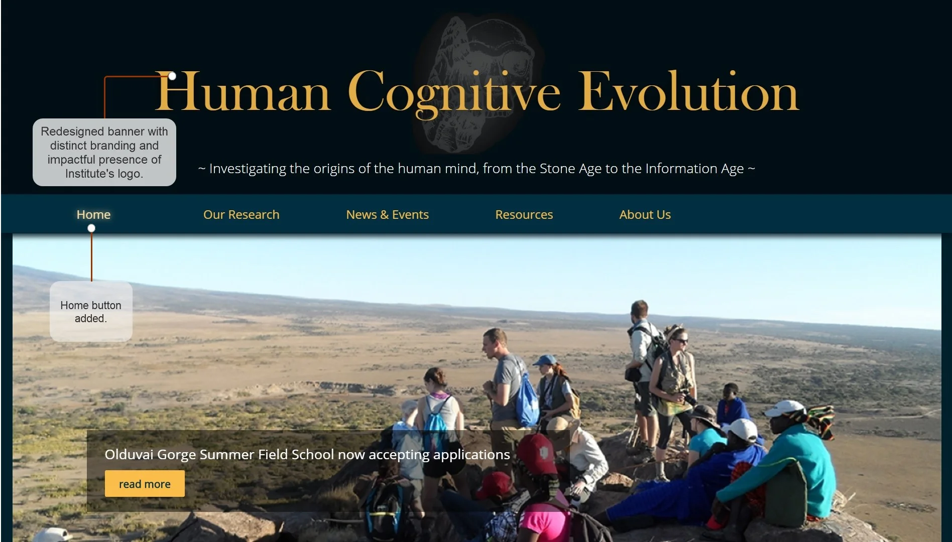
From talking to Nick and Kathy, I realized that the presence of the STI's logo was dearly important to them. It was equally important to communicate that to the audience. The website was chosen to have a dark colored background to create a mysterious appeal. I used the already-mysterious logo to advantage and created a banner which was equally mysterious, intriguing and authentic.
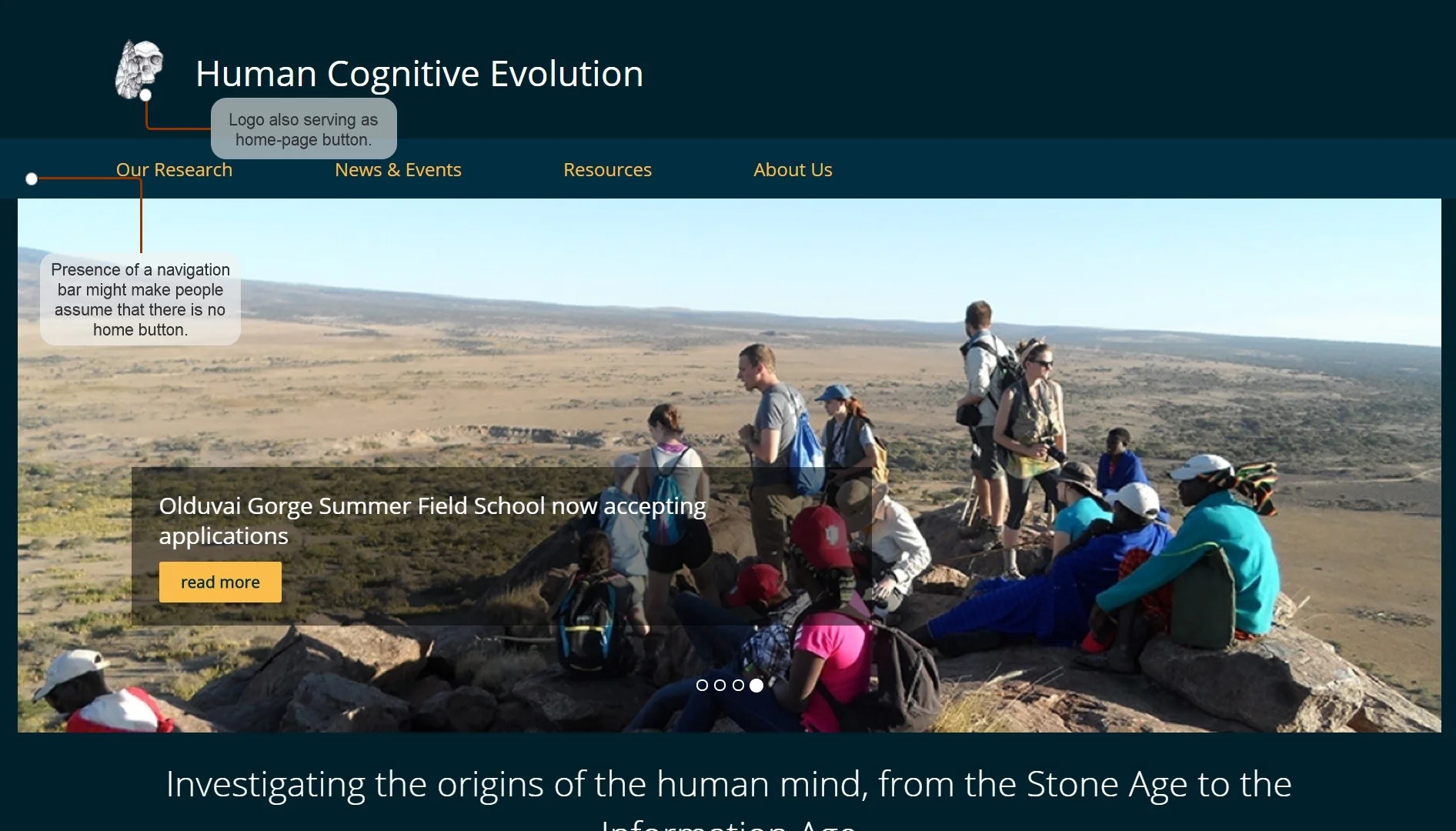
Additionally, the logo was serving as the home button, making it harder for users to find. To solve this, I created the 'Home' button and added a glow effect to highlight the current page.
BEFORE:
AFTER:
CREATION OF PANELS
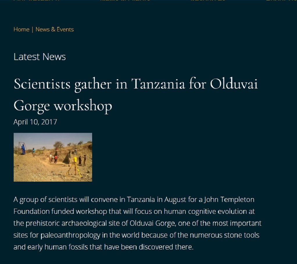
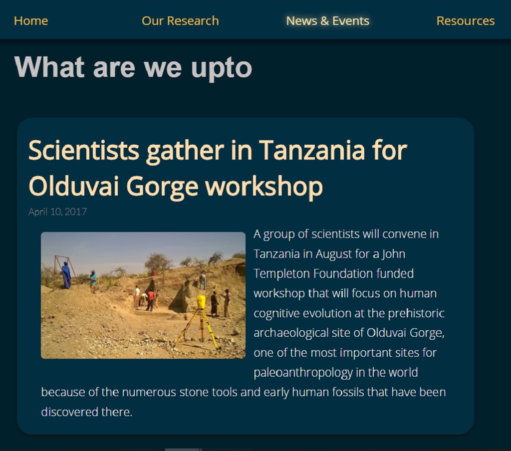
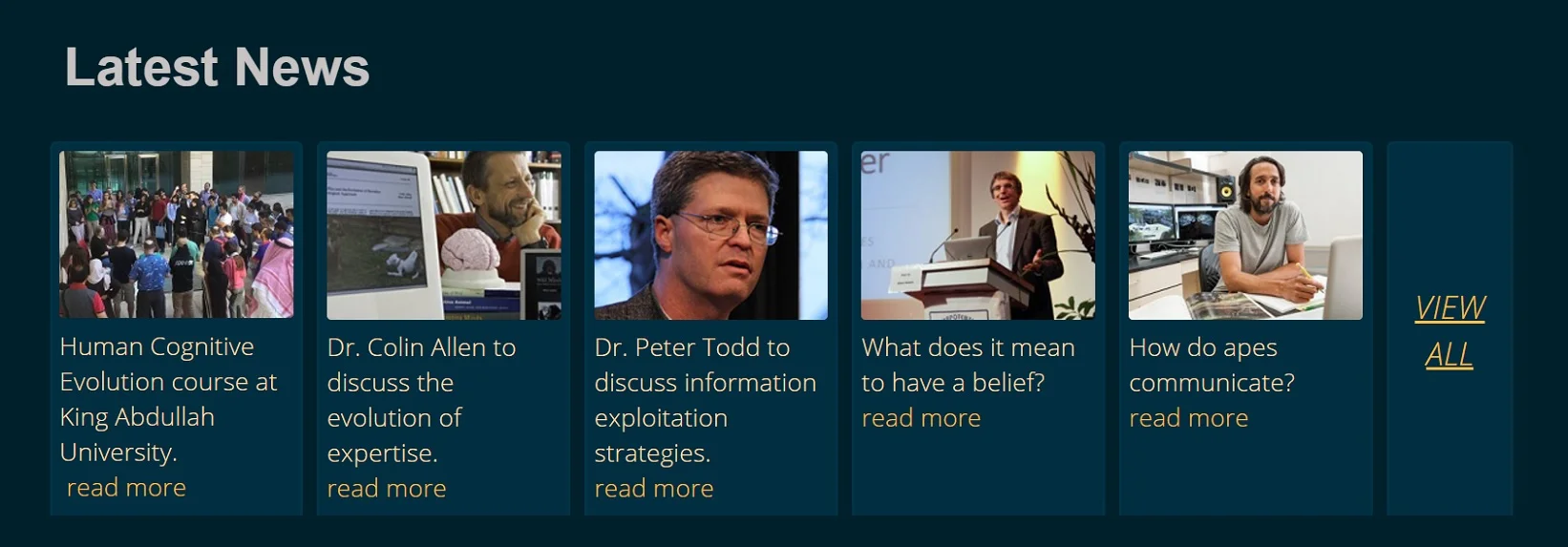
A dark background with white bright text was hard for users to read the information and articles presented on the website. My solution to fix the issue was to create a lighter colored background panels for text.
BEFORE:
AFTER:
BEFORE:
AFTER:
REDESIGN OF 'NEWS & EVENTS' PAGE
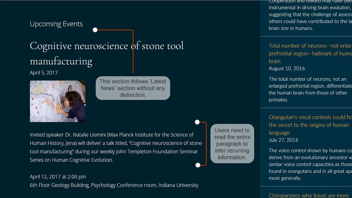
The 'News & Events' page consisted of all the latest research initiatives taken by the institute and its affiliates, followed by a long list of 'upcoming events' and 'past events' conducted by them.
Upon further analysis, I figured that those events represented a weekly seminar series, inviting guest speakers from different parts of the country. Those events needed a call to action. But there was no clear distinction between research activities and seminar events, there was a high chance that the users would never discover that there was a weekly seminar series of high value.
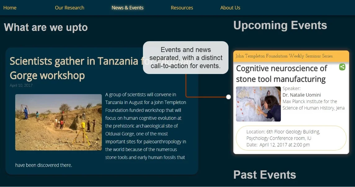
After several iterations, I redesigned the page with a clear distinction between news and events and a definitive call-to-action for upcoming events.
BEFORE:
AFTER:
Link to HCE website: https://www.iu.edu/~cogevol/beta/hcnewsevents.html
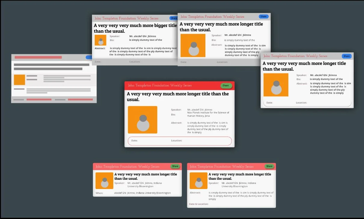
Several iterations of wireframes and mockups designed for the 'Upcoming Events' and 'Past Events' section.
THINGS I LEARNED
Web UI Design - By designing developing and testing several web UI visual elements and interactions. I learned a great deal about Color theory, Typography and the industry trends.
Rapid Prototyping - I enhanced my rapid-prototyping skills because of the several iterations of the visual elements I did using HTML, CSS and Javascript.
Working Independently - Throughout the project, I took up multiple roles of designer developer, web-admin and Information architect. Being the sole hire for the job, I got a chance to explore my potential of bringing a project to completion.
Information Architecture - Although it was not required for me to alter the information architecture of the existing website. I voluntarily took responsibility to improve and correct the information architecture, layout and titles of the site.
A Tradeoff- Being both the designer and developer put me in a odd position where I could not justify both the roles completely sincce with more complex designs came the burden of longer coding period. Throughout the project, I did several tradeoffs between design and development centric decisions.
